L, the first thing I'd say to that is: BEFORE you start hammering nails into the wall, consider doing a little sample layout with paper cut out like the shape of the frame so you can get an idea how it will look ala:
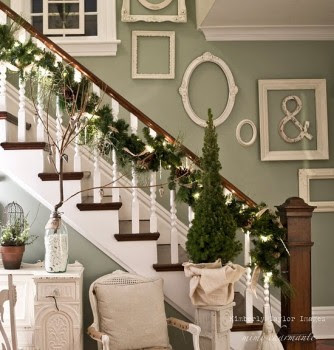
Lauren's doing her frames in gold...I picture it to be sort of like this but more spread out. BUT, this is Lauren's place not mine so I wanted to give her lots of different inspiration.
Does anyone else have tips or experience in a project like this for Lauren?


Check out how these folks used newsprint templates to figure out where to hang the frames. I thought it was genius: http://www.younghouselove.com/2011/04/its-done-and-we-heart-it/
ReplyDelete